Research
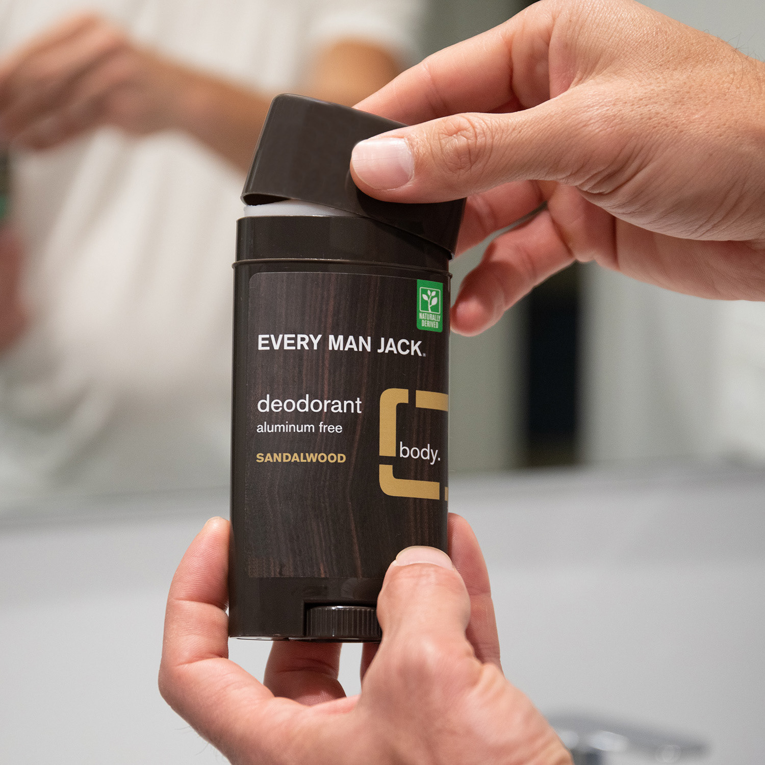
Deodorant Stick
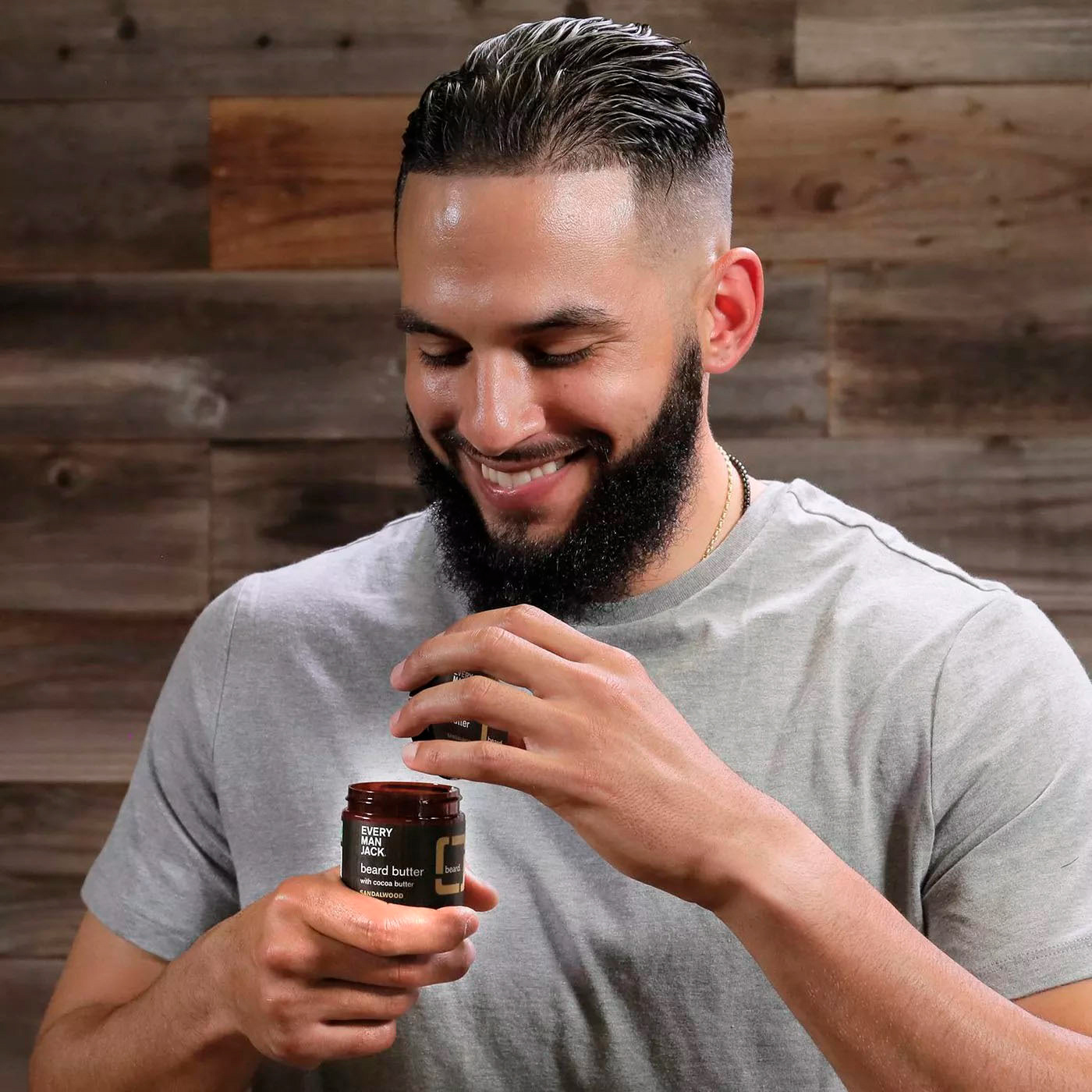
Optimal User
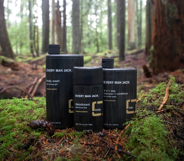
Line of Products
What is Every Man Jack
Every Man Jack is a body care company targeted
toward men. Their products consist of soaps,
deodorants, colognes, lotions, beard care, and hand
sanitizers. They also sell accessories like combs and
travel bags. They describe their mission as “...using
Naturally Derived Ingredients and making sustainably
minded choices, Every Man Jack inspires men to take
care of themselves and the world around them.”
Design Brief
-The package must fit on a 12” x 18” page when unfolded
-Integrate wood textures and common colors
-Use preexisting scents
-Promote the positive environmental messages
-Appeal to the common “man” (masculine person)
-Must be affordable (look affordable)
Concept Sketches
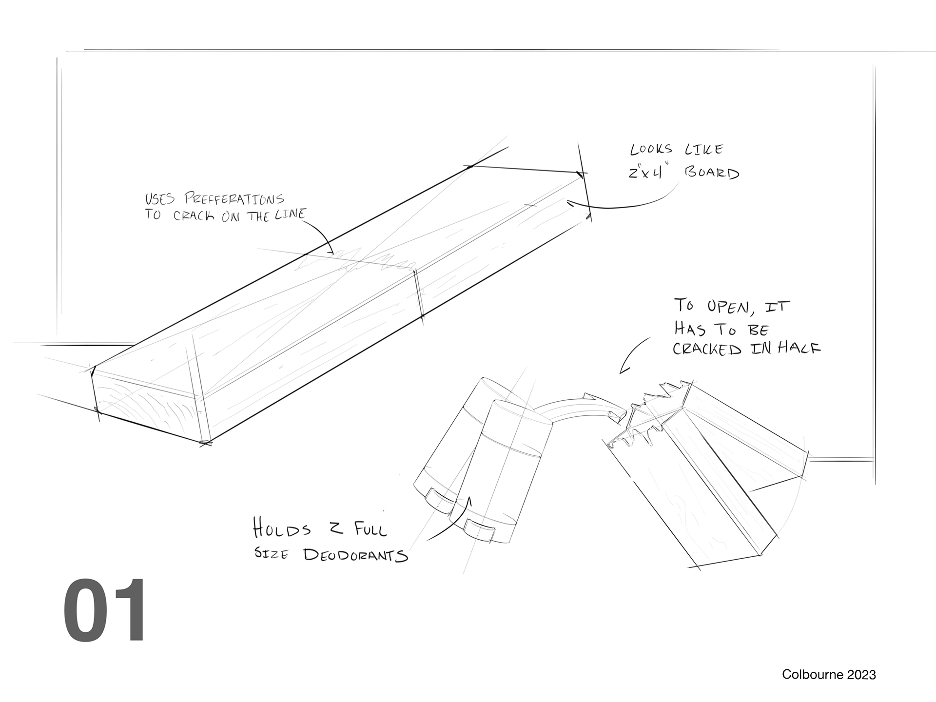
01’s design is centered around the wood theme. This design would look like a 2 x4 on the shelf and would have 2 deodorant sticks. To get the product out the user would have to snap the package in half, breaking the board with their bare hands.
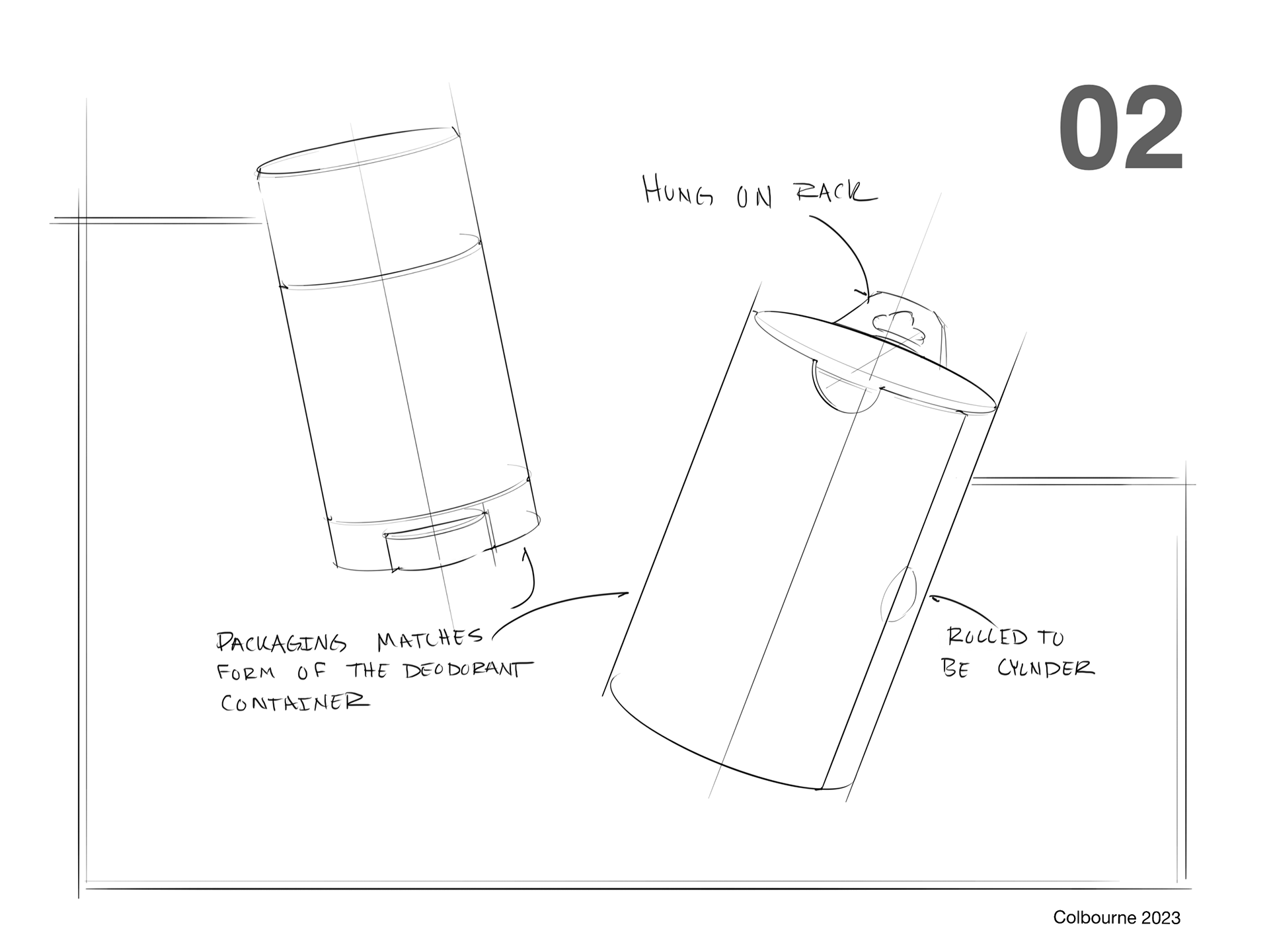
02 focused on the shape language of the existing Every Man Jack packaging. It would be rolled together to match the oval shape of the deodorant stick.
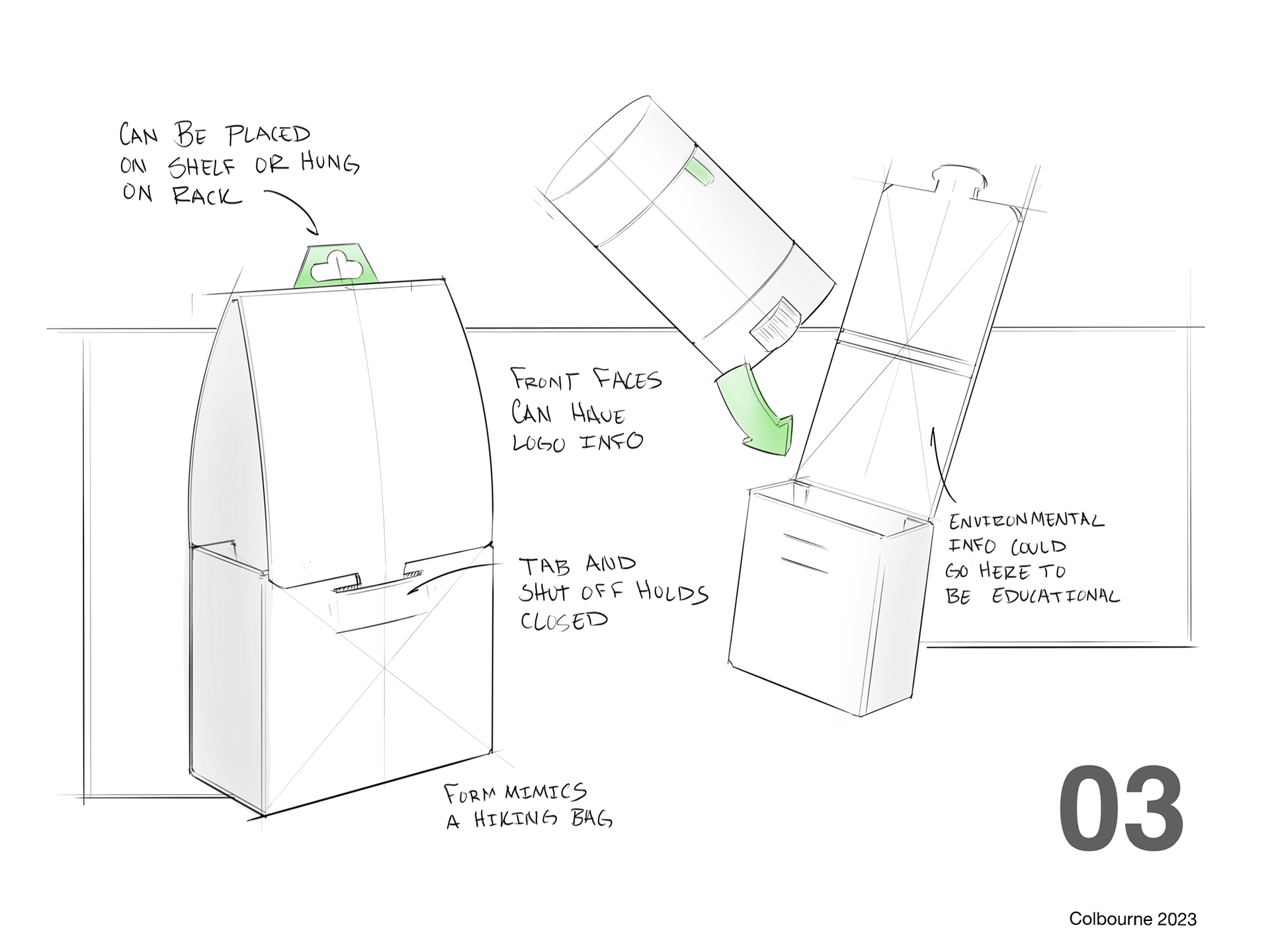
03 was based on a hiking backpack. The idea was to have something that looked outdoorsy and gave space on the packaging to talk about the mission statement of the brand.
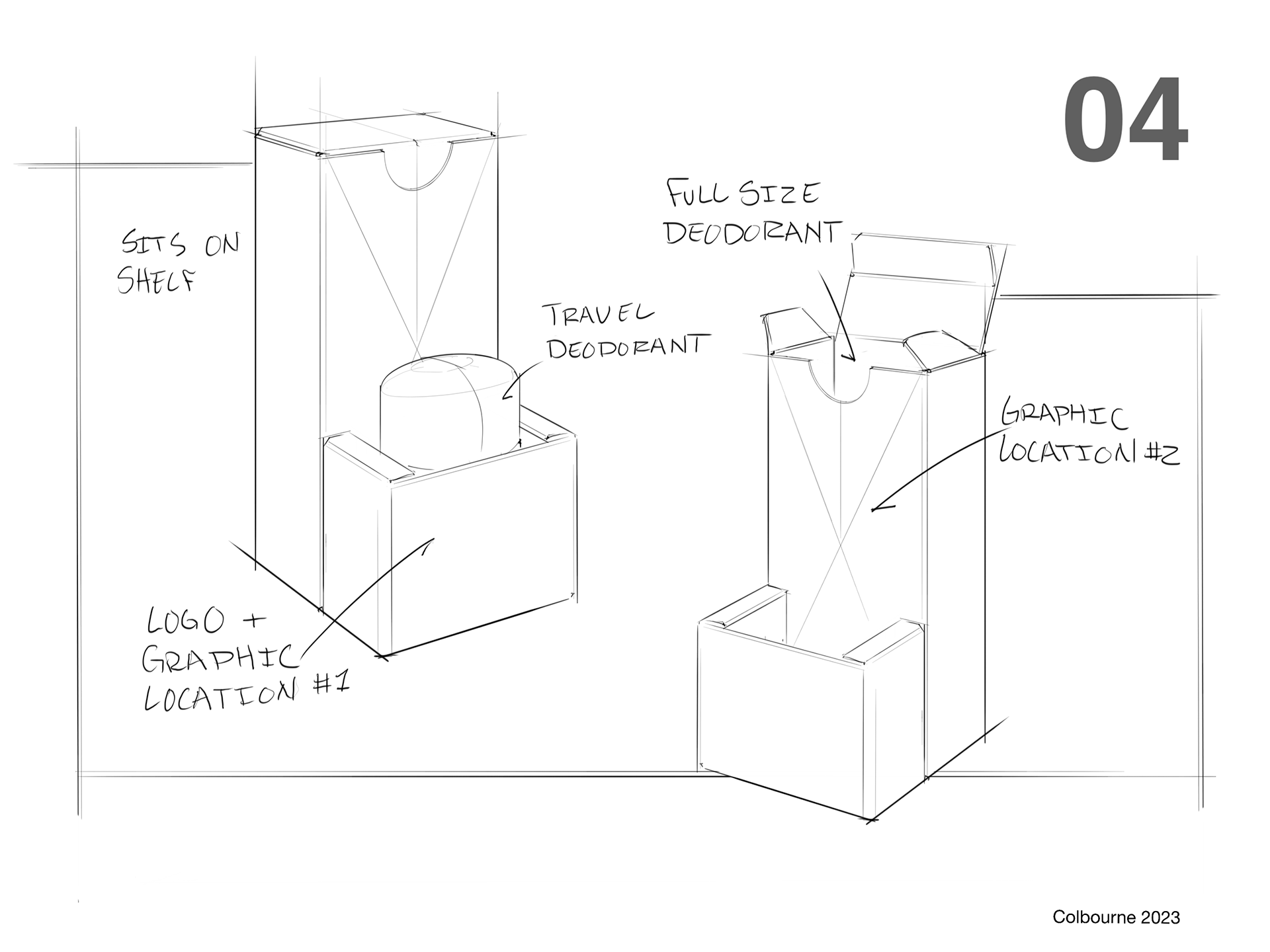
04 is a dual pack, Every Man Jack loves its bundles so I wanted it to carry a travel container and a full size
05 is based on the wine and beer packaging from the trend board. It also was a way to create successful packaging with less material.
The final direction was 05, it gave me a great space to add all of the messaging I wanted and followed the environmentally friendly ideals that Every Man Jack promotes. Because of the paper size, I only included room for one stick, however, this would be a great alternative to plastic when selling a dual pack.
The Dieline
I created multiple paper models of the packaging, exploring different angles and sizes until I felt confident in the design. A struggle I found was stability, the sides would curve more than I wanted them to. To fix this I changed the angle of the interior piece and opted to glue it to both sides of the packaging instead of the bottom, as seen in my sketch. This did limit my space for graphic elements but did not affect the overall design.
The Graphics
I started the graphic design process by getting an idea of the company's branding, I looked back at the mood board and imitated what I saw on their packaging, I took this design and picked out what I didn't like.
From here I started to evolve the design through a series of little changes, I specifically played with the wood textures and the square graphic, my biggest complaint with the original packaging was that it all felt slapped together, and nothing interacted with each other. So I focused on making the elements integrate with the text.
Final Model
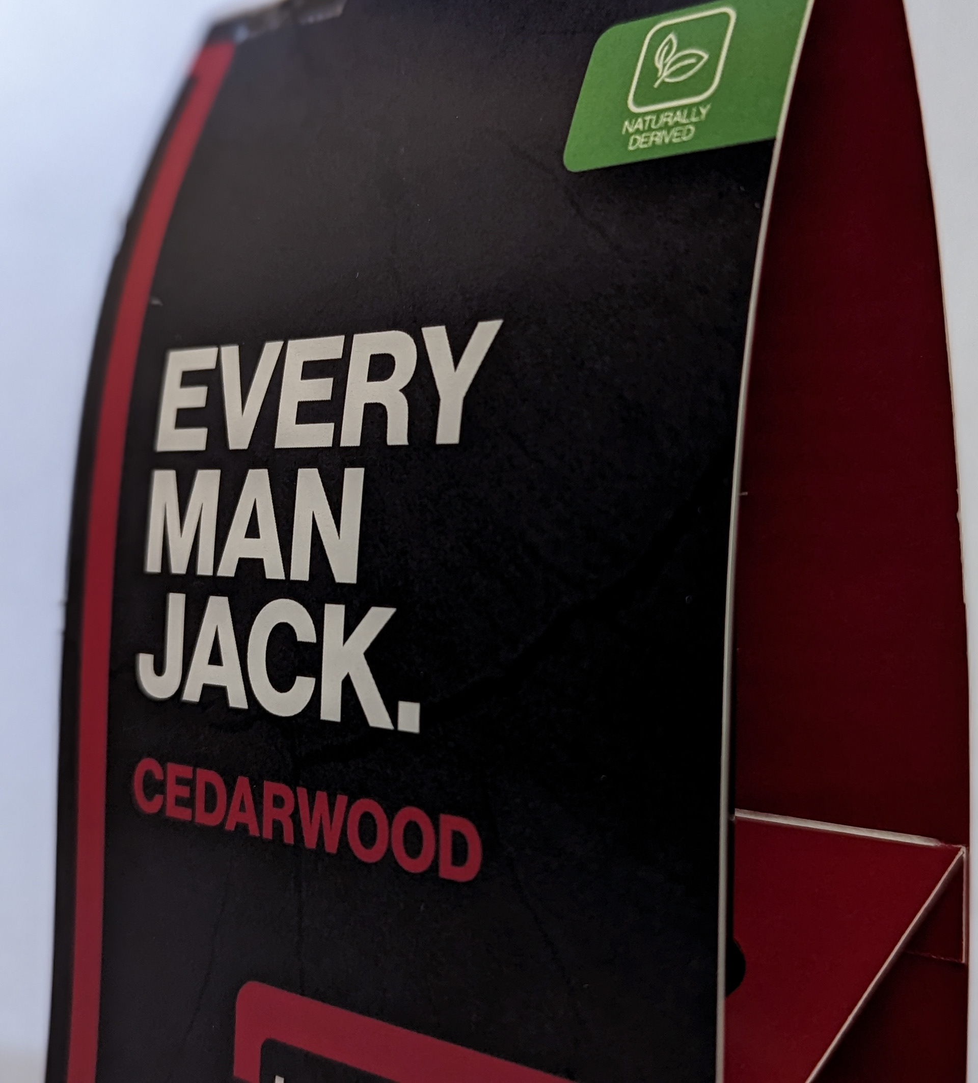
Front of Packaging
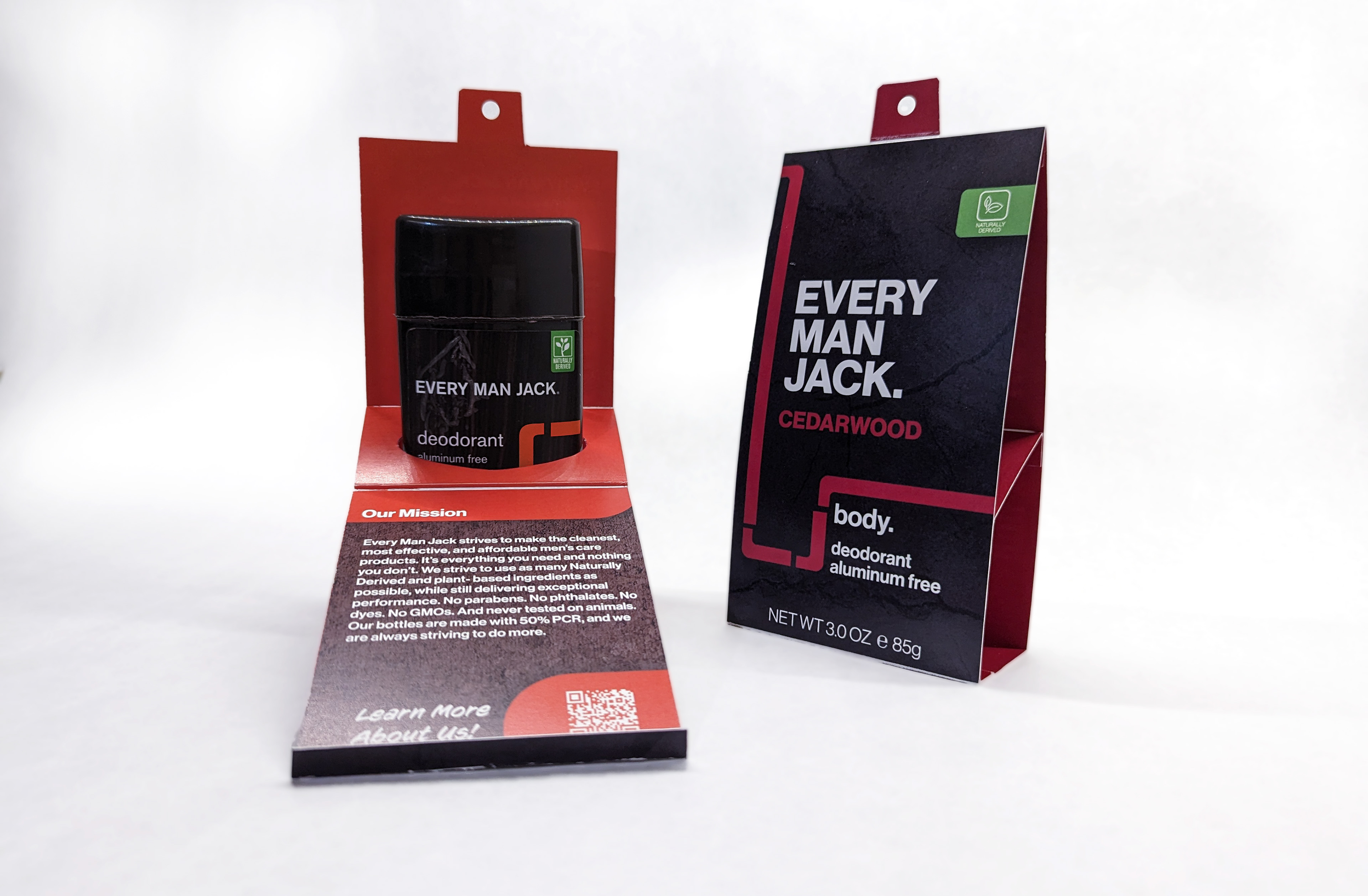
On the inside there is information about the company with a QR Code to their website
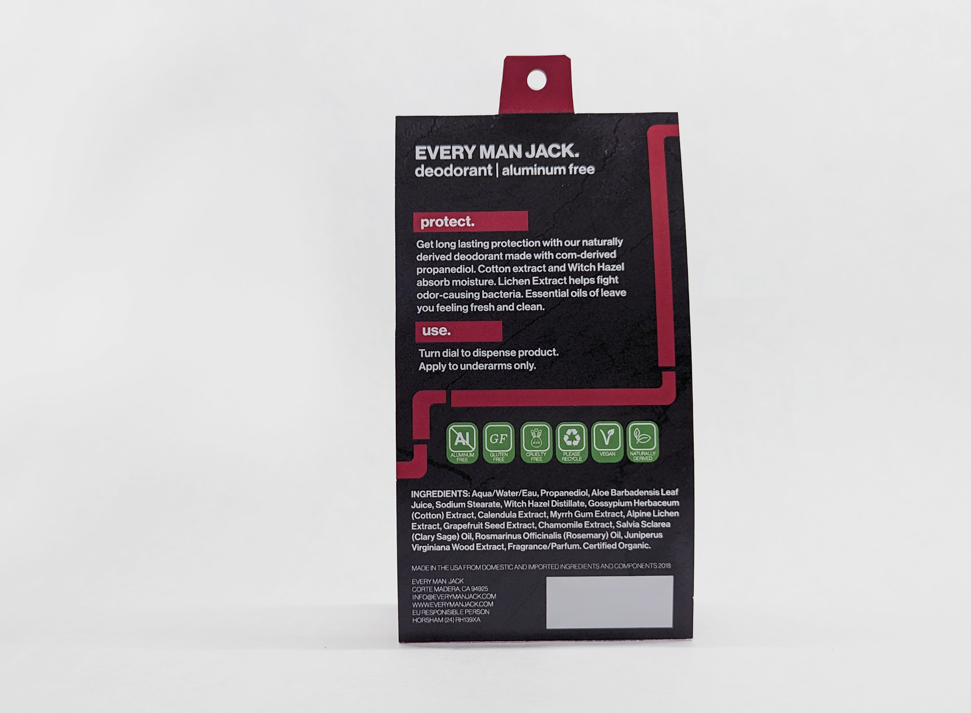
Back contains information about its ingredients and how its intended to be used
